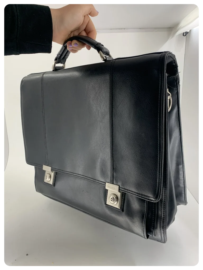
This project started with an assignment to choose a physical item to focus on for the entire school period. The goal was to build a brand around this item, considering brand values and target audience.
I chose a bag and aimed to turn this ordinary item into a status symbol by making the brand appear as luxurious and high-end as possible.
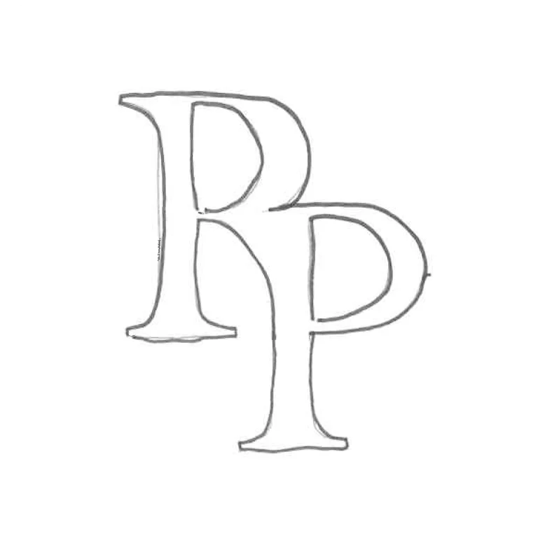
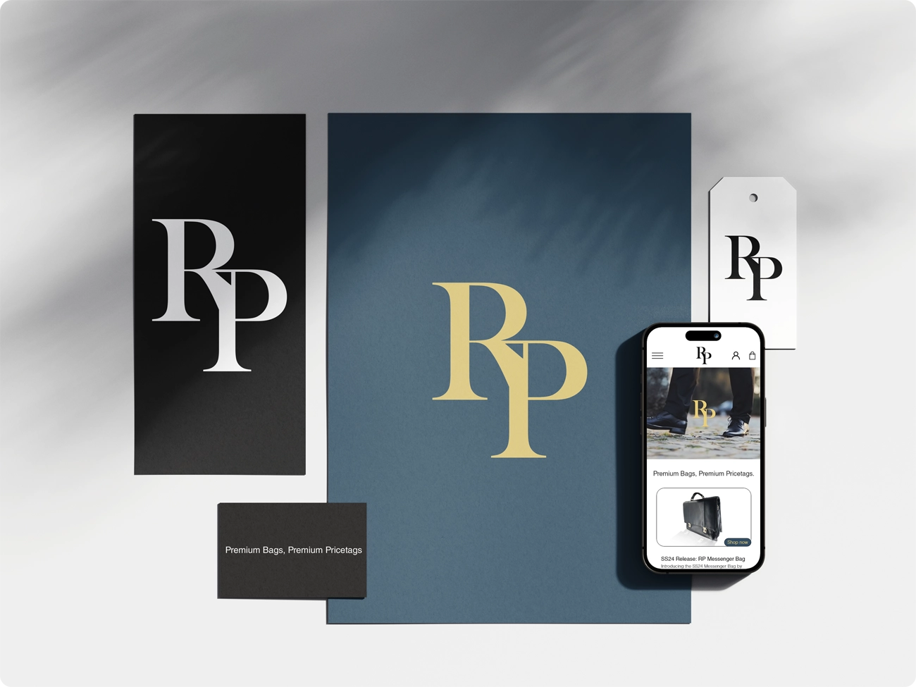
The design process began by developing a monogram logo for the brand.
After sketching about nine different concepts, I realized that my very first idea best captured the luxury I was looking for. This initial sketch became the foundation of the final design.
After finalizing the logo in illustrator I started experimenting with colors. My first idea was to incorporate gold, but I also wanted to choose a background color that could serve as an accent throughout the project.
After further testing and refining, I decided on a charcoal-blue shade, which perfectly complemented the luxurious aesthetic of the brand.
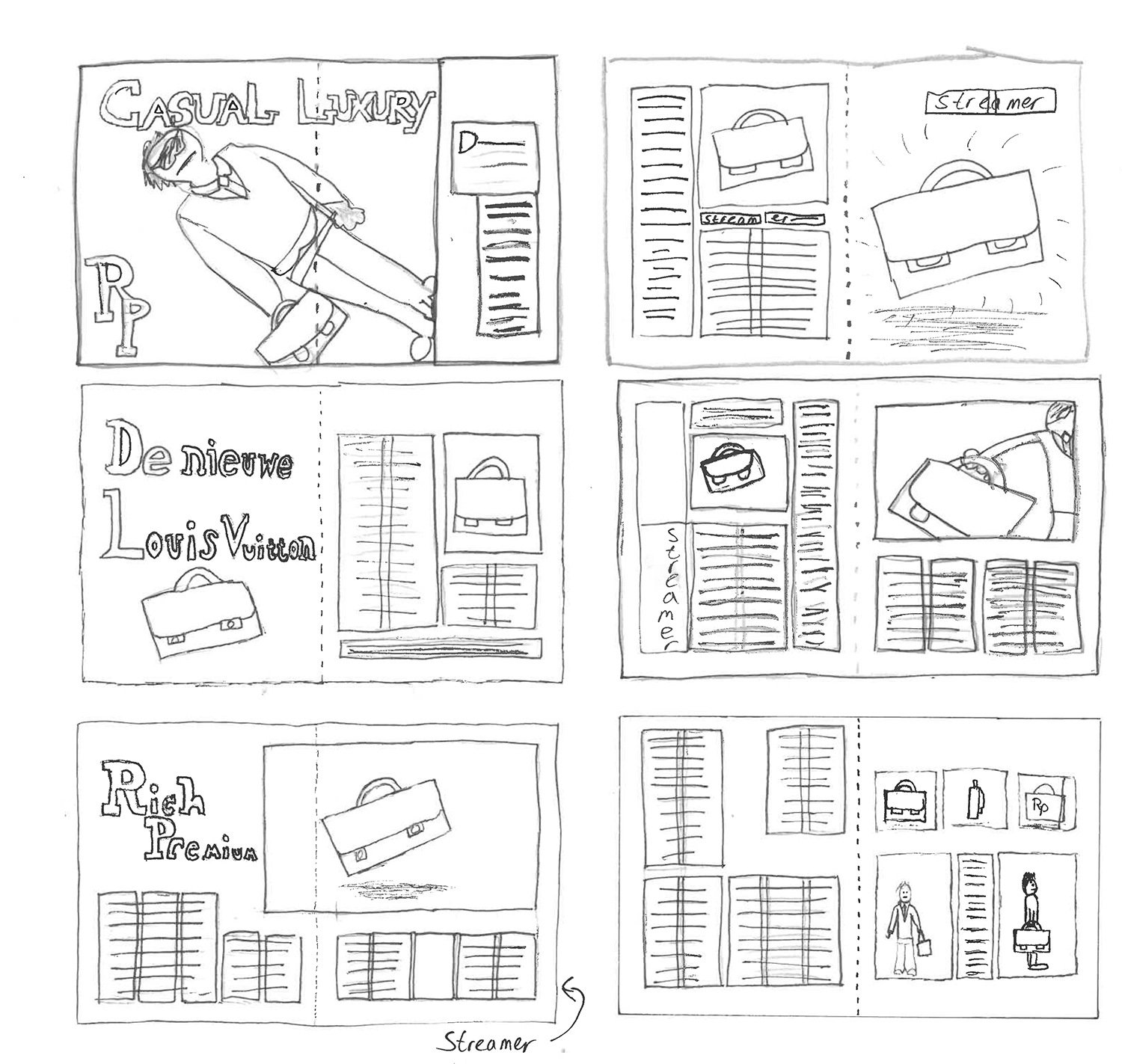
After I got done with the logo I got the assignment to design spreads for a magazine based on the brand. Again, this process started by sketching.
After some consideration I thought the last sketch I made was the best of the three spreads, I ended up turning those sketches into the final version.
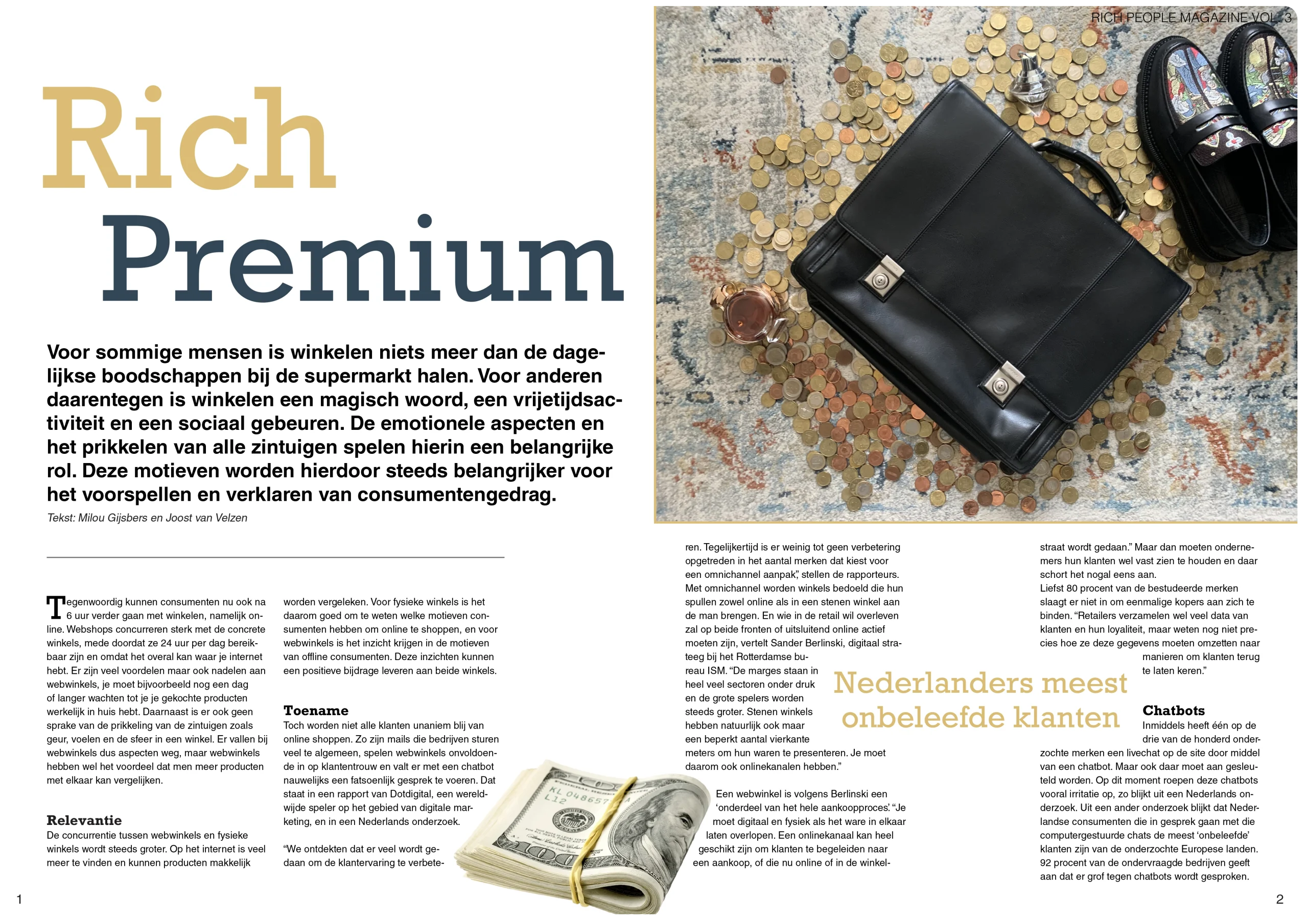
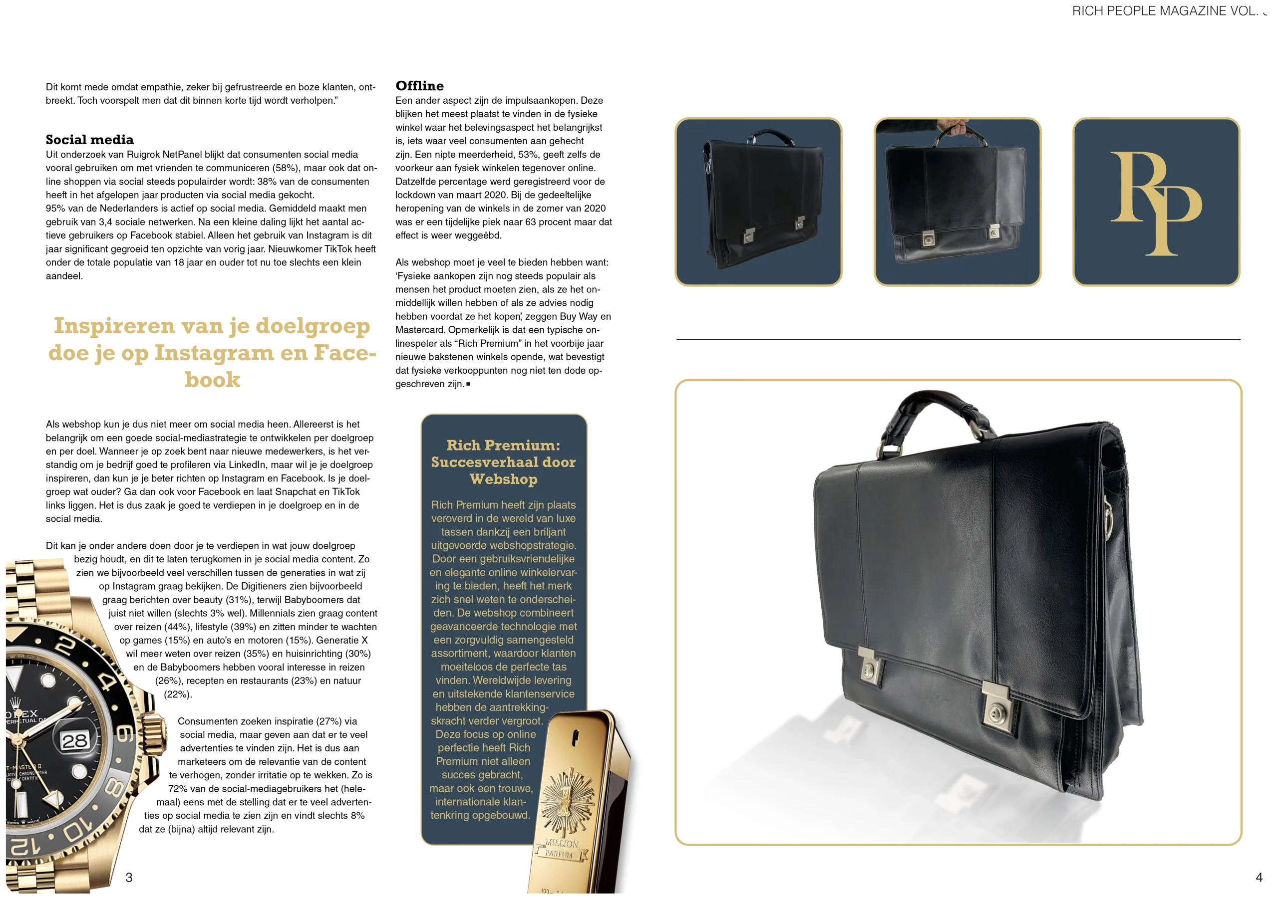
These are the final verisons of the spreads I designed in InDesign, I ended up with a slightly different layout than I had initially sketched, because it ended up not working with the amount of text.
I tried to mostly use the same colors that were seen in the mongram logo, and I think it worked out perfectly.
Overall I was very satisfied with how the spreads turned out.
(click spreads to expand)
The last assignment I was given for this project was to create a functional prototype webshop to view on a phone.
This process was so much fun to me, it was my first time working with Adobe XD, so it opened a lot of doors for me.