To begin this project, my classmates and I were each assigned a different eco-friendly business, each with its own set of brand values. I was assigned Mighty Tiny, an eco-friendly tiny house company whose values are energy efficiency, simplicity, and self-sufficiency.
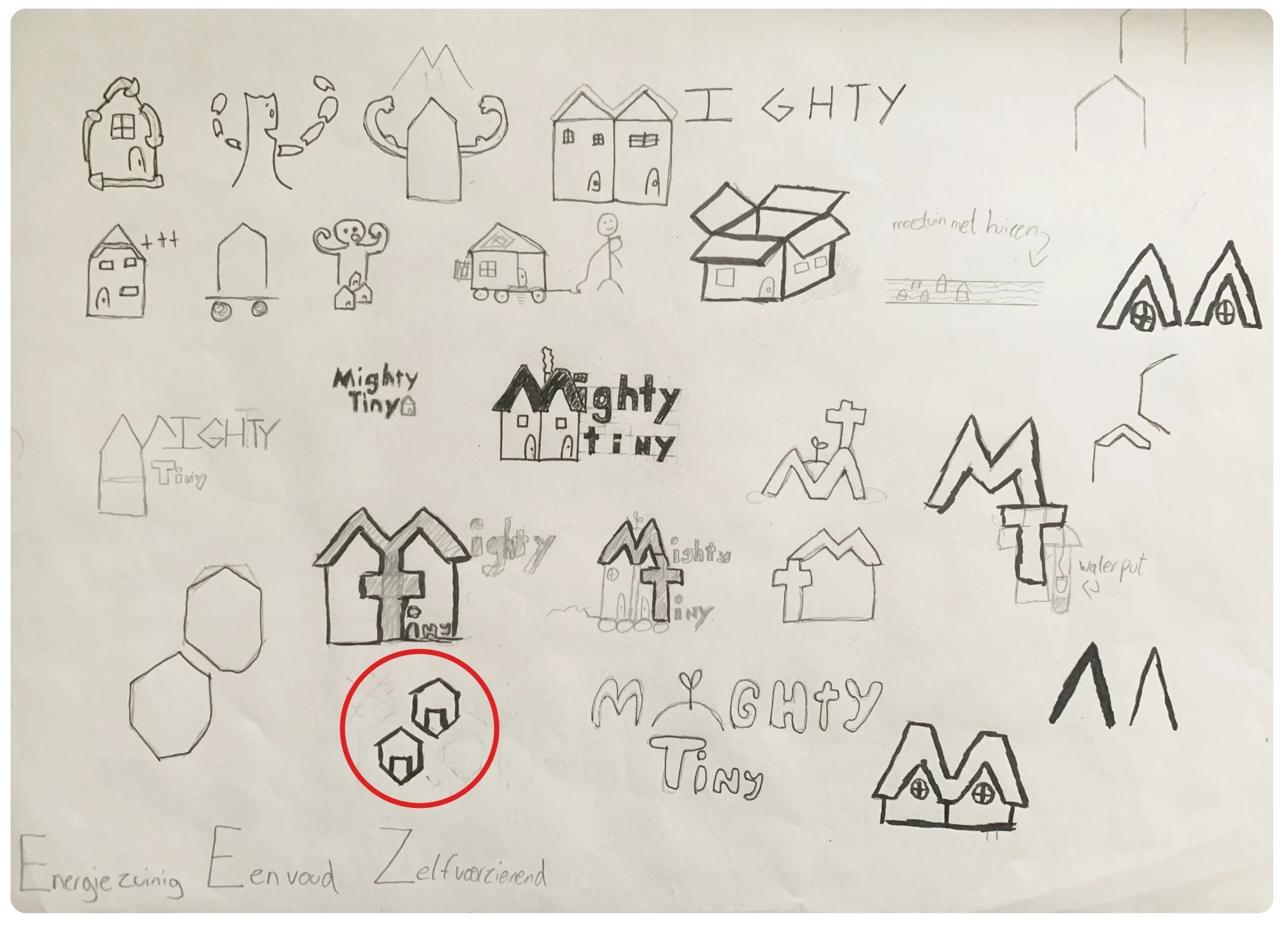
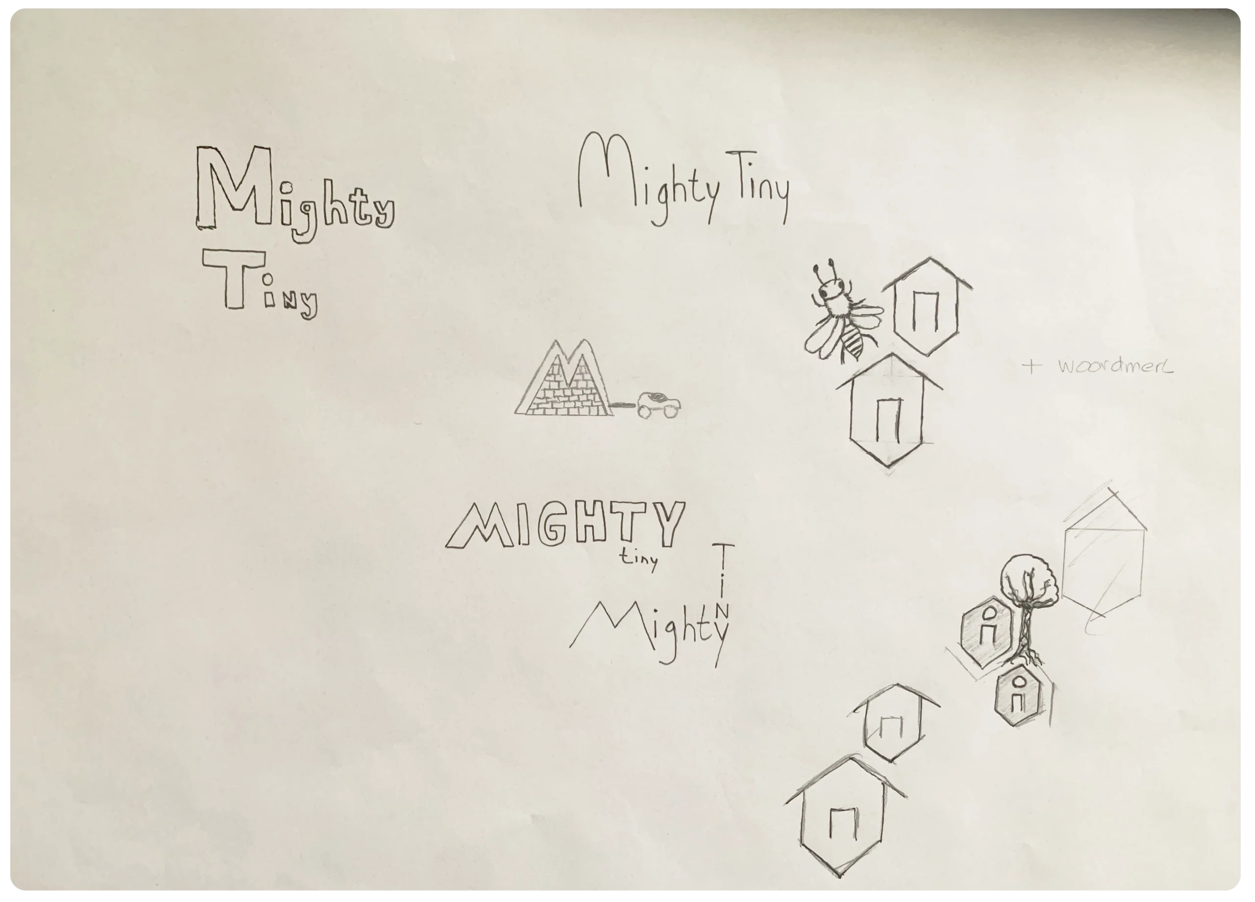
The first task was to sketch logo concepts that reflected at least two of these values. After experimenting with many ideas (see image to the right), I developed a design featuring two houses arranged in a honeycomb pattern. This concept was inspired by bees, which are self-sufficient creatures that build honeycombs—paralleling how Mighty Tiny creates self-sufficient homes.
I initially explored ways to expand this idea further, but quickly realized that simplicity is also central to the brand’s identity. Therefore, I decided to refine my original concept and translate it into a clear, finished logo.
After the sketching phase, I moved on to vectorizing and finalizing the logo. This stage also involved selecting the primary brand colors.
I chose a bright green for one of the houses to highlight the eco-friendly aspect of the brand. For the other house, I selected a golden-orange shade to reinforce the honeycomb concept, making the connection clearer and strengthening the meaning behind the logo.
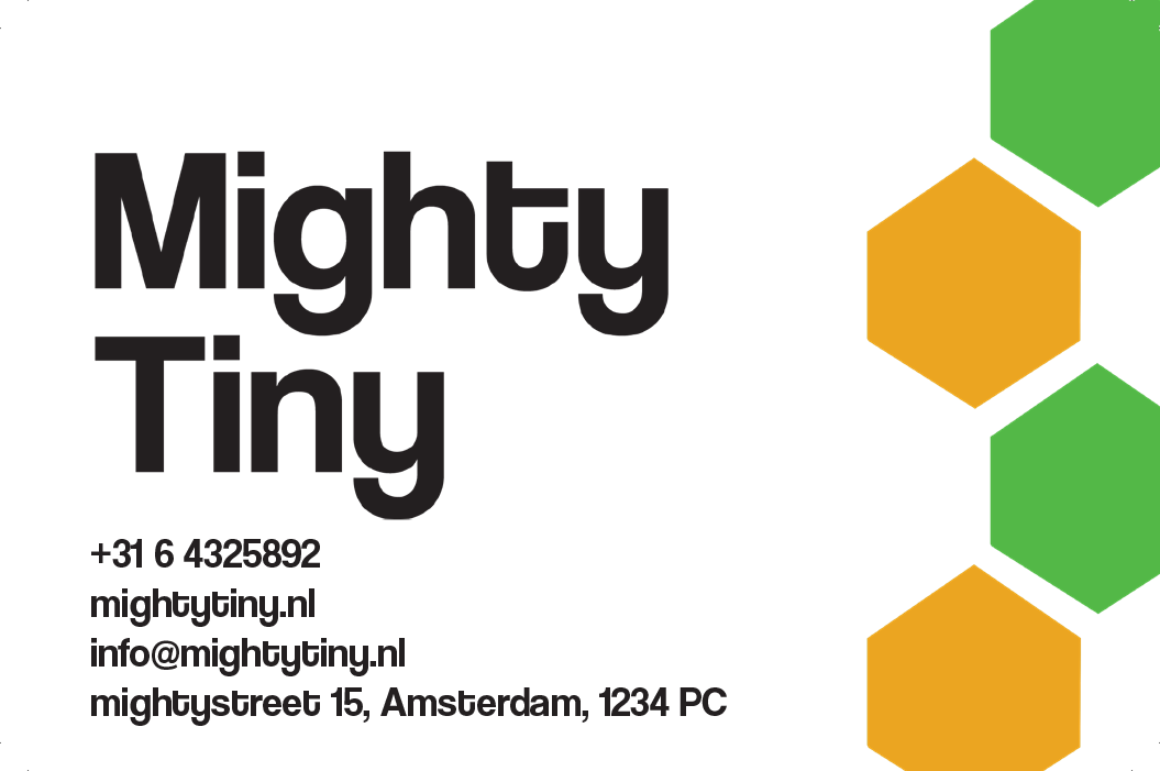
Once the logo was completed, I moved on to designing the brand’s stationery, including business cards, envelopes, and other materials.
This process was relatively quick, as the brand’s colors and overall aesthetic had already been established. The main remaining task was to select a font that aligned with the brand identity. I wanted something modern, simple, and sleek, which led me to choose Helvetica. Its timeless yet clean appearance made it a strong fit for the brand.
Business card for Mighty tiny
For the final assignment of this project, I animated the logo I had designed. I kept the animation simple and clean, avoiding excessive effects. This approach maintained the modern vibe of the brand that I wanted to convey.
Overall, this project was one of my favorites, as I was very satisfied with how I managed to translate the brand values into both the logo and the overall branding.